
Most landing pages fail because they’re too polite. Learn 5 fixes that grab attention,
name the pain, and turn traffic into conversions.
Most landing pages are bland, beautiful lies. They talk around the problem instead of punching you in the gut with the reality your audience is living.
They’re clean, scrollable, packed with modern UI and soft gradients… and completely forgettable. What’s worse - they’re built to make the founder feel good, not to convert the person reading it.
When I started building landing pages for early-stage startups, I made the mistakes I see everywhere now:
I prioritised the founder’s vision, not the reader’s urgency.
The result was that whilst pages were technically correct and beautifully designed… they were also completely ineffective…
After a decade or so refining my method when building landing pages, I now see the same mistake everywhere. Marketers looking for website upgrades prioritise beauty, and the content gets left behind.
This decade has taught me many things about content marketing and design, but one thing I’ve come to believe is that:
Most landing pages fail not because they’re ugly, but because they’re too polite.
They dance around the problem.
They try to impress instead of convert.
They assume the reader will take time to figure it out.
But the reality is, the best landing pages don’t wait. They grab attention because they name the thing no one else will say out loud. They reflect a real, felt problem, not just a positioning exercise. And they do it fast.
“When your audience is drowning in decisions, the most respectful thing you can do is say what you really mean, and say it quickly.”
This month, we explore how to inject urgency, specificity, and tension into landing pages, without losing trust.
Why now: Startups are under pressure to convert. CAC is up, attention is down. Founders and lean teams are realising: traffic doesn’t matter if your landing page isn’t converting.
When I get asked to redesign or rewrite a landing page, the request is usually framed as a visual problem.
“The layout feels off.”
“The colours aren't exciting.”
“It just needs to feel more modern.”
But nine times out of ten, the real issue is not design. It’s direction.
The landing page doesn’t know what job it’s trying to do.
And if you’re not clear on what you want someone to do or feel, then your prospects won’t be either.
After working on dozens of landing pages for startups across different stages, I’ve noticed the same five problems show up again and again. Not just in the design or the copy, but in the thinking.
These are the issues that quietly kill conversions.
I’ve made all of them. Most of our clients have too.
Here’s what to look out for, and how to fix them.
This is the most important five seconds of your entire site and most headlines honestly waste it.
They use vague benefit language like “scale faster” or “empower your team”. Phrases that could sit on any landing page in any category.
The problem isn’t just that these headlines are generic.
It’s that they don’t build trust. They don’t reflect any real understanding of what your reader is going through or why they’re even on your page.
What to do instead:
Speak directly to the reader’s felt experience, not the founder’s vision.
A useful test:
If your headline could be copied and pasted onto another startup’s site, it’s not specific enough.
Instead of:
"The fastest way to build better campaigns."
Try:
"Your marketing’s stuck in feedback loops. We help you deliver on time."
Startups love listing out features. But features rarely trigger action.
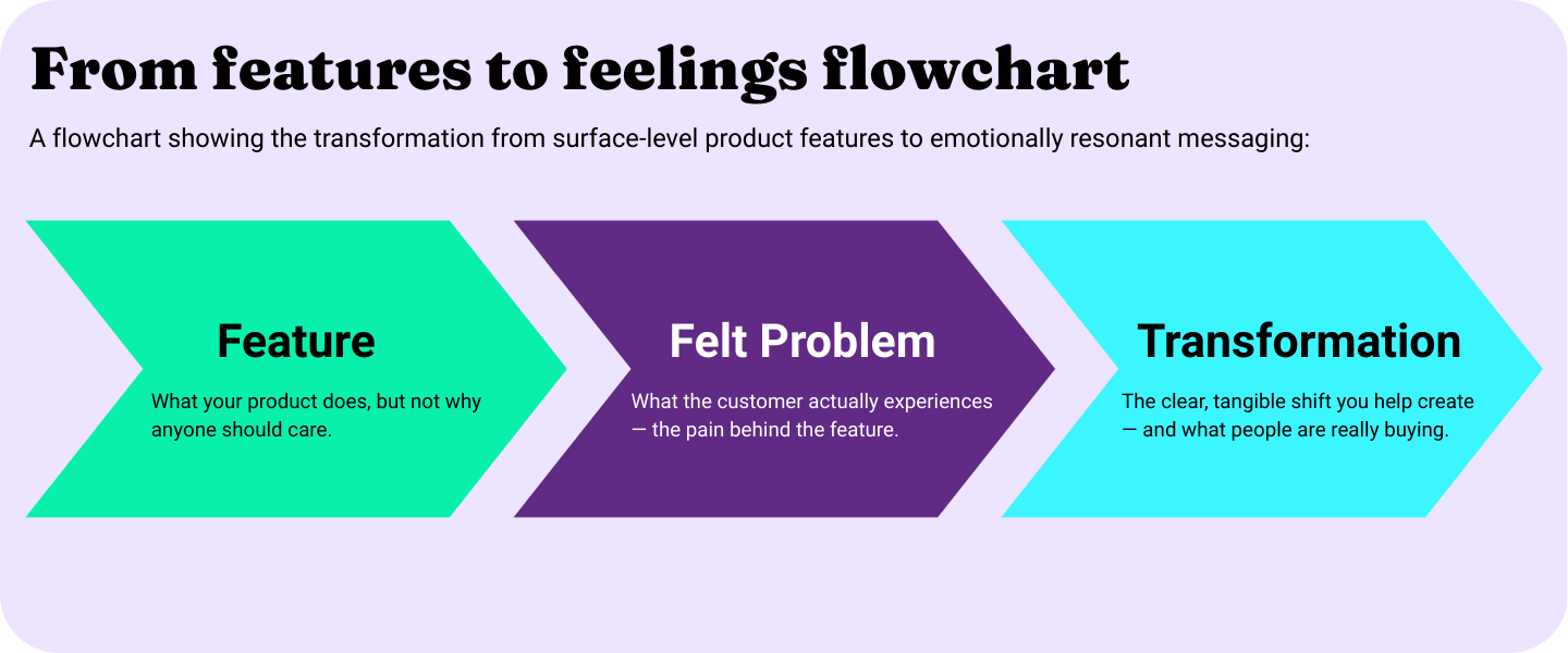
What does? Relief. Progress. Clarity. That’s what your prospects are actually buying.
When I think about the best-performing pages we’ve worked on, they don’t just explain what the product does. They narrate the before and after. They help someone recognise themselves and imagine themselves with the solution.
What to do instead:
Use what I like to call, the “from X to Y” framing method.
Anchor your message in a transformation.
This works especially well above the fold. For example:
“From approval ping-pong to assets live in 48 hours.”
Or even more emotionally charged:
“From blank page paralysis to your next five posts scheduled.”
It's not about exaggerating. It's about making the shift tangible.
A good landing page has one job. One promise. And one path.
But in an effort to hedge bets, I’ve seen pages try to speak to three different personas, promote five different features, and link out to every corner of the website, all within the first scroll.
This doesn’t help you reach more people. It just creates noise. And noise is what kills momentum.
What to do instead:
Treat your landing page like a focused sales call.
One problem. One promise. One clear CTA.
Every section of the page should ladder up to that one goal. If it doesn’t, cut it or move it to another page.
This one’s counterintuitive, especially coming from a design studio.
But the reality is clean design is not enough. And sometimes, the very elements that make a page feel “slick” (animations, illustrations, minimalist layouts) also make it harder for someone to understand what you actually do.
Design should support the message, not distract from it.
If someone has to hunt for your headline or decode what you’re selling based on iconography, it doesn’t matter how nice the page looks. It’s not doing its job.
What to do instead:
Prioritise clarity over creativity.
Use design to guide, not impress.
Start with a layout hierarchy: where does the eye go first?
Then test contrast: is the most important message visually prominent?
And finally, ask a stranger: can they tell what you offer in five seconds?
Tone is trust. And most startup landing pages still sound like they were written by someone trying to impress a boardroom (or AI…)
You end up with phrases like “end-to-end solution” or “a robust platform to enable scalable growth.”
…Technically accurate. Emotionally empty.
People don’t buy from platforms. They buy from people who get it.
What to do instead:
Write how you’d speak if you were explaining your product in real life.
Here’s my quick check:
Read your copy out loud.
If it feels awkward or formal, rewrite it until it sounds like something you’d say on a call with a prospective customer.
Good copy doesn’t mean casual. It means clear, conversational and credible.
One of the most useful exercises I’ve borrowed (and adapted) from editorial review is what I call the “5-second gut-punch test.”
Here’s how it works:
Open your landing page.
Pretend you're your ideal customer.
Give yourself 5 seconds, no scrolling.
Then ask:
“Do I feel seen?”
“Do I immediately understand what this solves?”
“Do I want to keep reading or am I already bouncing?”
Most of the time, the answer is no.
And it’s not because the product isn’t valuable, it’s because the page isn’t grounded in urgency, clarity, or narrative control.
If you only take one thing from this post, let it be this:
The job of your landing page is not to inform. It’s to quickly convert attention into interest.
And that happens through tension.
A truth named. A pain surfaced. A next step made obvious.
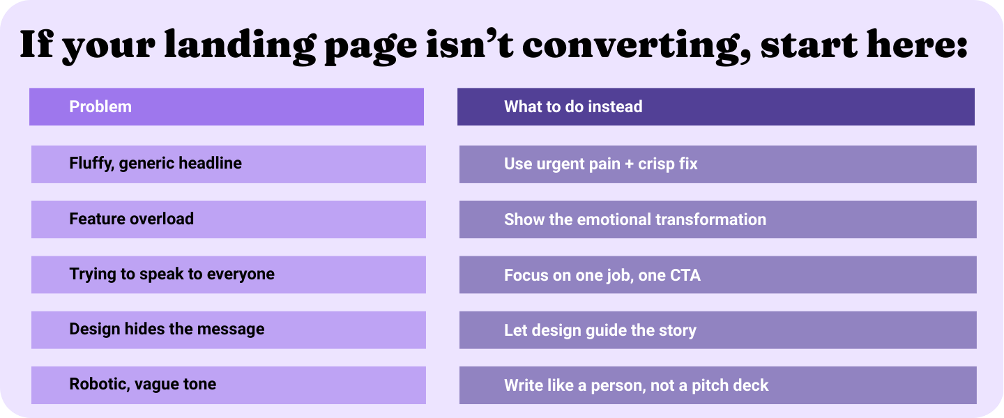
These aren’t surface-level tweaks. They’re decisions that force clarity, and when your page is clear, everything else performs better:
Your paid campaigns. Your email signups. Your demo requests. Your bounce rate.
Fixing a landing page isn’t about making it prettier, it’s about making it honest.
I’ve spent the past few weeks collecting some of the most confusing, beautiful, over-designed, under-explained landing pages on the internet, alongside the ones that actually convert.
I’m calling it:
The swipe file of shame (and what to steal instead)
It’s a tactical breakdown of what works, what doesn’t, and what to steal for your own team.
I’m Helen, co-founder of Loga. We’re a creative studio that builds brands, landing pages, and content engines for startups and lean teams who need momentum without compromising quality.
More importantly, I’ve sat where you sit. I’ve been everything from in the trenches of an IC, through to leading marketing functions in start + scale ups. I get it.
You’re launching fast, you’re doing too much, and you don’t have time for 17 feedback rounds on a landing page.
You just need it to work.
We build for that.
